What is Firebreak Week?
The Digital, Data and Technology team (DDaT) run Firebreak Week every 3 months. It sees teams temporarily disband, providing the opportunity for self-directed time to work on short term projects such as improving GOV.UK. It’s also a chance to keep our skills fresh and try our hand at new things which is really important for our continued learning and development. You can read more about it in this blog.
What is Dark Mode?
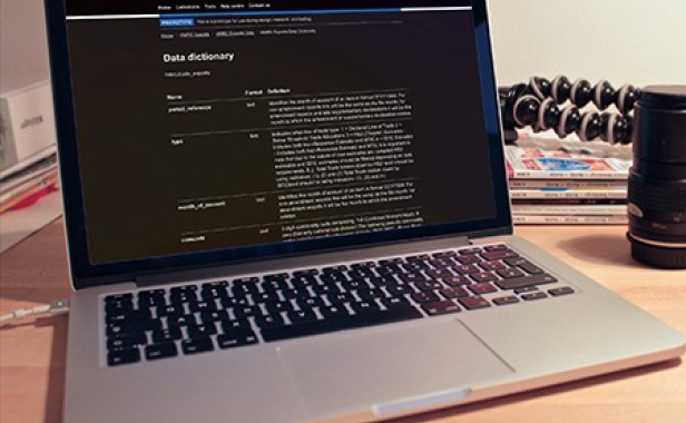
Dark Mode is a display setting for user interfaces, such as smartphones or laptops. It means that a light colour text (white or grey) is presented against a dark or black screen, instead of the default dark text showing up against a light screen (known as ‘light mode’).
How and why did you investigate Dark Mode?
I’m Graham Sanders, a Senior Interaction Designer working within the Data Infrastructure team in the Department for Business and Trade (DBT). My role is to develop design concepts across complex GOV.UK services based on the evidence of user needs.
The idea for this project came from viewing the DBT website late at night and noticing immediately the impact the glare from the screen had on my eyes. I thought to myself, ‘why isn’t there a setting where I can quickly change the monitor to improve the viewing experience?’
I set up the project on Trello which is a planning and collaboration tool. I was happily surprised at the interest shown in the project, forming together a group of like-minded individuals who also understood the issue. My team included Ieuan Parker, an Interaction Designer, Laura Wood, a User Researcher, and Rachael Irwin and Tom Swart who are Data Analysts.
Researching the impact of Dark Mode
We spoke to 6 participants:
- 3 said they use Dark Mode as default
- 2 had some experience of using Dark Mode
- 1 had not used Dark Mode.
2 of the users we spoke to had visual impairments. They highlighted the importance of Dark Mode enabling them to do their job.
User research helped to identify several other benefits of Dark Mode which included:
- reduced eye strain and fatigue
- improved battery life (for OLED and LED screens)
- less carbon footprint generation
- visual hierarchy and focus
- emphasis on content
- aesthetic appeal and personalisation.
A study published in Nature Research’s Scientific Reports in 2018 suggests that sustained exposure to light-mode may be associated with myopia (Near-sightedness).
We carried out some data analysis investigations and found:
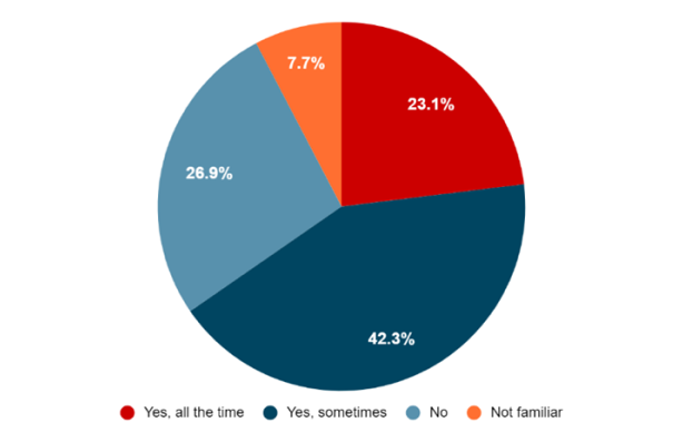
- 23% of DBT users asked would use Dark Mode all the time if it was available on GOV.UK websites
- 42% would use Dark Mode some of the time

- A third of DBT users' access GOV.UK websites after sunset or before dawn
We did some additional research and discovered that:
- 92% of developers prefer dark mode (Stack Overflow, 2020 survey)
- 83% of Reddit users on the app have enabled dark mode (Reddit, 2021)
- 83% of users shift to dark mode on their phones after 10pm (Flurry Analytics)
What we did next
We created a prototype based on the technique of the websites’ theme being set by the preference chosen on your operating system theme settings. The website theme should be reflected when a user changes their MacOS theme or Windows theme.
This easy implementation allows us to custom select the colours of each element. It gives us the power to reduce any accessibility issues, when compared to Chrome, or any general plugins.
What was the outcome and what happens next?
We created a comprehensive presentation to share with the rest of DDaT. It covered workshops, research, user research, data analysis, design and a working prototype.
I designed a bespoke slide deck which matched the ‘dark mode’ subject and began the presentation to DDaT wearing a Darth Vader mask to illustrate the ‘dark side’. This was a deliberate ploy to make the presentation memorable and unique. It was well-received by my peers, receiving 58% of the votes from all the Firebreak projects. I hope that our initial findings can be expanded upon and implemented in some form.
Ieuan Parker, an Interaction Designer on the team, also contacted the Design System team at GDS (Government Digital Service). He asked them if we could do our own research and implementation on our services, as we know from our research, that we have users who struggle to work with the current light theme. The result of this was very positive, and we got the approval to start working on it. As a result of this, the Data Infrastructure team have a plan in the next couple of weeks to start work on implementing Dark Theme on Data Workspace, our corporate database.
 Laura Wood, User Researcher
I joined DBT in April 2023 and this was my first time working on a Firebreak project. I am passionate about making government services more accessible, so when I heard Graham’s pitch for exploring dark mode, I wanted to be involved.
I had some prior understanding of the benefits of dark mode for users with accessibility requirements. This was reinforced when I conducted user research with DBT colleagues. The user perspective had a great impact on us as a team and has encouraged us to keep shouting about the benefits of dark mode.
Firebreak was also a fantastic opportunity to work with colleagues outside my team. We had a great range of skills (and enthusiasm!), and we collaborated well to explore this opportunity.
 Rachael Irwin, Data Analyst
Firebreak is a great opportunity to work on projects that interest you and collaborate with people you would not normally get the chance to work with. This firebreak was no different and my favourite so far! We had a great team who was determined to start the dark mode revolution and had great fun doing so. The highlight, of course, was Darth Vader's appearance at our presentation. I hope this project has made people more aware of dark mode and its advantages. Hopefully it can kick start the process of bringing dark mode to gov.uk sites, making the tools more accessible to everyone.
Ready to join the team? Check out our latest DDaT jobs on Jobvite.


